 Hello and Happy Halloween!
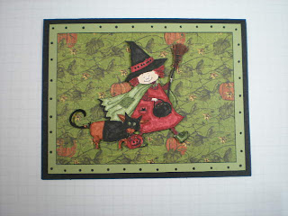
I created this card for my friend Verda, but after it was finished I knew that this wouldn't work as she has very poor eyesight and I could see that the image and the background would all blend together when she looked at it! She uses a magnifying glass to look at the cards I make for her and has her visiting nurse describe the detail to her. I needed to fix this problem - what to do?
 I knew I needed a lighter color behind the little witch to create a contrast between her and the background paper - but nothing I tried gave me the answer to the problem and also looked like it was part of the planned layout of the card. I tried different colors and shapes of CS, different stamp images - nothing worked. I had almost given up and accepted the fact that I would have to make her a different card (I could have made two cards in the time I spent stamping, cutting and then discarding in trying to solve this problem.)
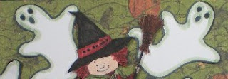
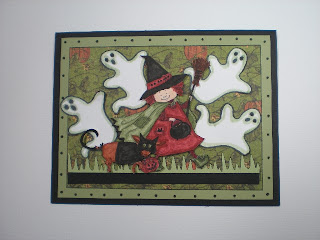
Then I found this little ghost stamp that I had never used and forgotten I had. Could that work?
 It did! To give some balance to the white of the little ghosts so it didn't look top heavy I added some grass with the lighter green CS and then a narrow stip of black - and I was very happy with the results.
Thanks for stopping by today! Wishing you lots of good Halloween treats!
Barbara Diane

3 comments:
What a great card. I like both versions of the card. I think she will love it.
Diane, these are gorgeous! I actually like the brightness of the ghostly card. How special that you did that for your friend.
Oh my! The perfect touch for sure!
Post a Comment